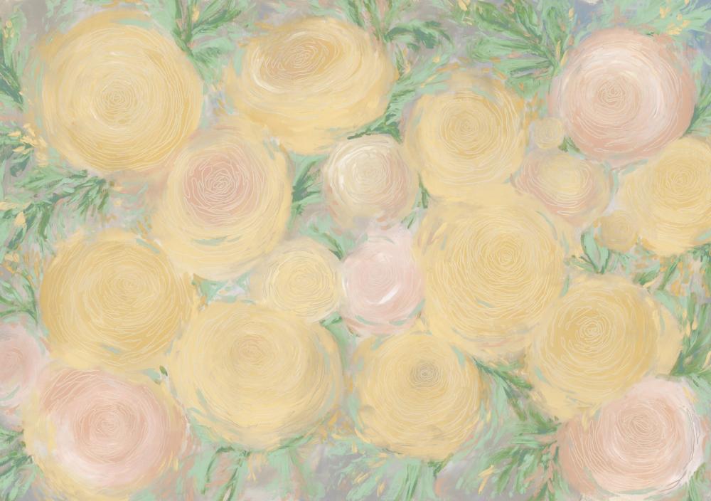
Our Oh Roses, Spring wallpaper, created in collaboration with Blursbyai, brings an expressive floral composition into the home through soft colour and painterly gesture. Generous, swirling blooms in warm buttery yellow and delicate blush pink overlap across the surface, framed by painterly sage foliage and fine, continuous contour lines that trace each petal. The soft, layered brushwork gives the floral motif a gentle, impressionistic presence that feels decorative without overpowering a space. Like all our mural wallpapers, this design is made to measure to your exact wall dimensions on PVC-free paper with a subtle surface structure.
In the room
We see this floral design working particularly well on an accent wall in a bedroom, where the soft yellow and blush tones bring a gentle, welcoming warmth behind a bedhead. Because the blooms have a relatively large visual scale and organic distribution, giving the wallpaper a wide, uninterrupted wall allows the full composition of overlapping roses to be seen at its best.
In a living room or dedicated dining space, our wall murals create an inviting visual backdrop without demanding high-contrast furniture to balance them. The painterly greens and warm floral tones sit comfortably in rooms with plenty of daylight, which brings out the subtle differences between the pale yellow highlights and the blush undertones in the petals. It also works charmingly in a quiet reading corner or dressing room where you want the walls to feel decorative and softly enveloping.
Styling it
When styling around this floral wallpaper, we prefer to let the soft palette and fluid line work take centre stage by keeping major furniture pieces relatively simple in form.
Warm, natural wood tones such as ash, birch, or pale oak complement the buttery yellow and peach hues naturally, maintaining an airy, Scandinavian or modern country feel. If you prefer a slightly more classic look, painted furniture in warm off-white or soft cream echoes the lighter highlights in the petals without competing with the pattern.
For textiles, we recommend solid, woven fabrics such as unbleached cotton or washed linen in neutral sand, muted moss green, or pale blush. Keeping surrounding rugs and curtains plain or subtly textured ensures the room feels balanced, giving our wallpapers the space to act as the primary visual element in the interior.
Colour combinations
The verified palette within our wallpaper centres on warm buttercup yellow, creamy ivory, and pale blush pink, grounded by sage, olive, and mint greens in the leaf work. Soft grey and neutral brushstrokes peek through in the background, keeping the overall contrast gentle and harmonious.
When selecting colours for adjacent painted walls, woodwork, and trim, consider these directions:
A soft, warm off-white or chalky cream creates a seamless transition that keeps the room bright and fresh.
A muted sage or pale eucalyptus green drawn directly from the leaves gives surrounding joinery or doors a grounded, botanical feel that connects naturally with the wallpaper.
For a warmer, more cocooning palette, a very light peach or muted blush on neighbouring walls reinforces the rosy tones in the blossoms, while soft warm grey on skirting boards echoes the cooler undertones in the background paintwork.
About our wallpaper
At Wallism, our wallpapers are made to measure based on your specific wall dimensions. Producing each order individually helps reduce unnecessary excess wallpaper compared with buying standard fixed-size rolls.
All our wall murals are printed on PVC-free paper featuring a subtle physical structure that gives the surface an authentic, paper-like feel. We offer wallpaper options designed to be easy to hang, making them well suited to both homeowners and people living in rented spaces looking to transform their walls.