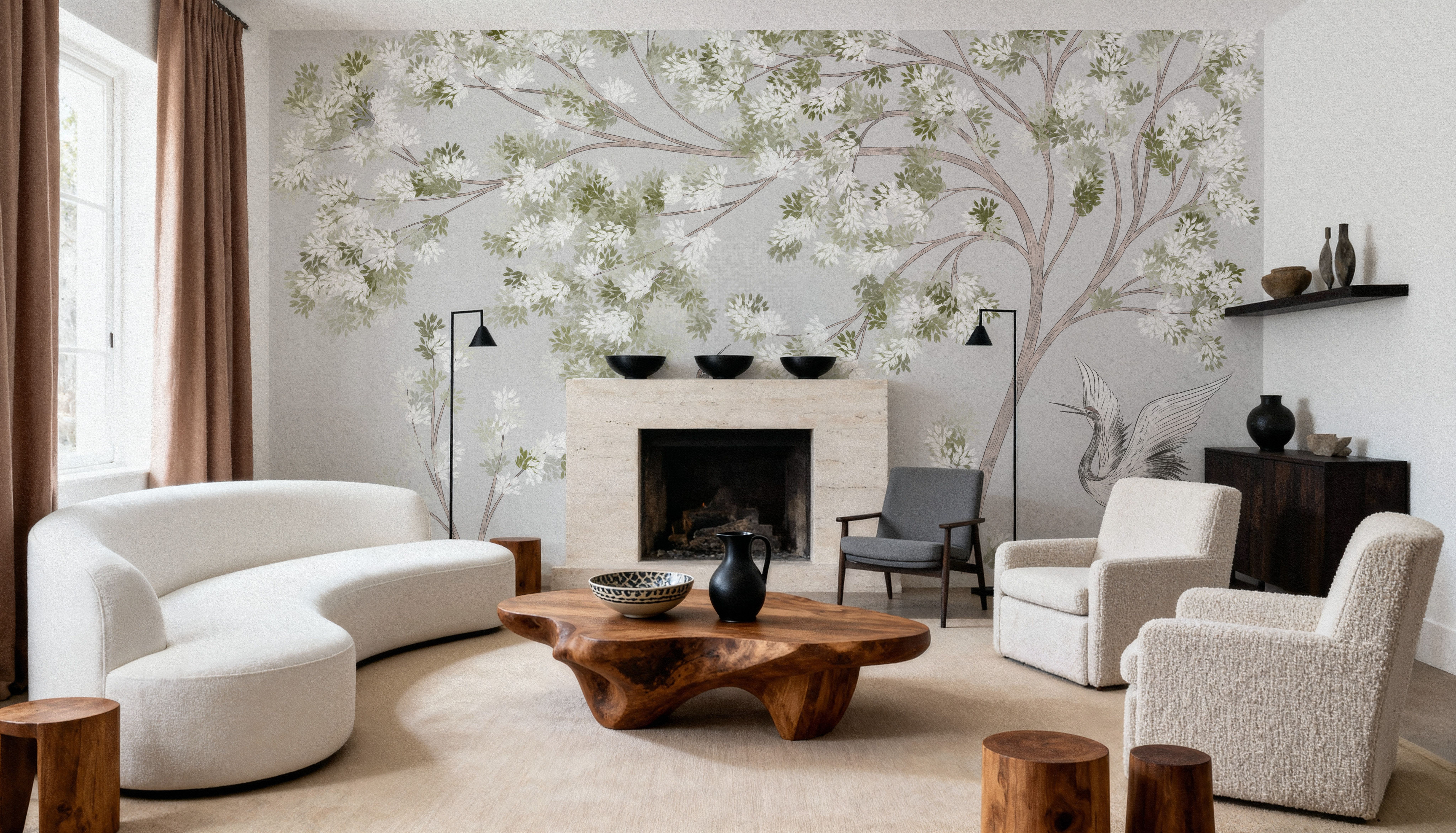
Which wall should be your accent wall? Choosing the right wall for a mural

Kyoto Grace, Fog by Irina Chikati, a chinoiserie landscape of blossom trees and cranes.

The best accent wall is usually the one you see first, with the fewest doors and windows breaking it up.

A mural adds one more test, the shape of the wall. The image is printed to your exact measurements, so the width and height of the wall decide how much of the design you will actually see.

Start with the wall you see first

Stand in the doorway and notice where your eye lands. In most living rooms it is the wall facing the entrance or the long wall behind the sofa. That is where a mural earns the most attention for the least wallpaper.

Then sit down where you spend most of your time, because many rooms have two views. In a bedroom, you see the headboard wall as you walk in and the opposite wall when you wake up. Both can work, so decide whether the design is for the room's first impression or for you.

A home office has a third viewer. The wall behind your chair is what colleagues see on every video call, while the wall you face is the one you live with through the working day.

Count what interrupts the wall

Doors, windows, radiators, a mounted TV and tall shelving all take something away from a mural. When you order, you measure the full width and height of the wall and ignore the openings. We print the mural as one complete rectangle, and the parts that fall over a window or door are cut away during installation, along with that piece of the picture.

Note roughly where each opening sits before you choose the design. A window might start a meter from the left corner and run 1.2 meters across. Knowing that, you can place the image so the part you care about stays on solid wall.

A wall with several openings often suits a different kind of design. Orchard Reverie by Cebine shows the difference well, because it comes in two versions. The mural gathers rolling hills and trees heavy with pears and lemons along the lower part of the wall, under an open cream sky. Orchard Reverie Pattern repeats the hills, trees and small animals across the whole surface. Cut a window out of the mural and you may lose the group of trees you liked most. Cut it out of the pattern and the same scene simply carries on around it.

Mural or repeating pattern?
Orchard Reverie
Orchard Reverie
Mural
Orchard Reverie Pattern
Repeating pattern
Printed to your wall measurements
✓
✓
Single focal point
✓
—
Survives a window or door cut-out
—
✓
Best wall shape
Long and unbroken
Any shape
What a cut-out removes
Part of the scene, permanently
Nothing, the pattern carries on
A mural is fitted to the shape of your wall, so for most people this is the step that matters most.

Compare the shape of the wall with the shape of the image

Murals made up more than nine in ten of the wallpapers in our orders over the past year. Unlike a repeating pattern, a mural is fitted to the shape of your wall, so for most people this is the step that matters most.

Divide the width of your wall by its height. A wall 4.8 meters wide and 2.4 meters high has a ratio of 2. A narrow wall between two doors, 1.2 meters wide and 2.4 meters high, has a ratio of 0.5. Many landscape murals are wider than they are tall, so a long wall can show almost the whole scene, while a narrow wall shows a vertical slice of it.

You can see this in the preview on the product page. Enter your measurements and the image is scaled to cover the wall, with the parts that fall outside shown faded around it. Click and drag to choose which part you keep.

Kyoto Grace, Fog by Irina Chikati is a good example of a design that holds up on a narrow wall. On a wall 1.2 by 2.4 meters, the preview shows a single tree with white blossom and pale green leaves, and two cranes standing beneath it. It still reads as a complete picture, because the design repeats its trees and birds across its width. A long wall gives you the whole grove.

Treeline Horizon by Pamela Munger behaves differently. Its interest lies in a broad sky of painterly clouds above an ochre field and a dark green treeline. On a long wall of about 4.8 by 2.4 meters, the image is scaled to the width and part of its height falls outside the frame. Drag it one way and you keep more sky. Drag it the other and the field and treeline come into view. Put the same image on a narrow wall and you mostly get cloud, with a band of field and trees at the bottom. That can be beautiful too, as long as it is the effect you want.

If a design leans one way, the Mirror option flips it. With Kyoto Grace on a narrow wall, mirroring moves the cranes to the other side of the trunk, so you can turn them toward the room instead of into a corner.

For an awkwardly shaped wall, an all-over design is the easy route. Layered Blues has no single focal point. Its sweeping diagonal currents of indigo, cerulean and aqua look intentional wherever the crop falls.

Check where the detail sits

Most accent walls have something standing in front of them. Before you settle on a wall, look at where the design keeps its detail. Orchard Reverie gathers its trees and hills in the lower part of the image, which suits the space above a low daybed or a crib. Behind a tall sideboard, much of that scene would disappear. Kyoto Grace places its blossom canopy high, so the trees stay visible above a headboard, although a tall one may hide the cranes at their feet.

Measure the height of the furniture that will stand against the wall. If the part you love sits below the top of the sofa, choose another crop or a design that carries its detail higher.

When the accent wall should turn a corner

Sometimes the best wall is really two. A bed set into an alcove, a reading corner or a dining nook can look more complete when the design continues around the corner. In that case, add the widths of the walls together and order them as one mural, so the image runs on without a break. Enter the combined width in the preview, and make sure the corner does not fall in the middle of the part you like best.